Color Comeback: Trending Shades for 2026 Kitchen Remodels
For years, white kitchens dominated design magazines, Pinterest boards, and new construction homes. But in 2026, the tide has officially turned. Homeowners are craving warmth, personality, and spaces that feel layered rather than sterile. The kitchen, long considered the heart of the home, is now becoming its most expressive room.
From earthy neutrals to rich, dramatic tones, this year’s trending kitchen colors reflect a desire for comfort, individuality, and connection to nature. If you’re planning a remodel, here’s what’s defining the color comeback in 2026.
1. The Shift: Why Color Is Back in a Big Way
Minimalism isn’t disappearing…. it’s evolving. Instead of cool grays and stark whites, we’re seeing softer palettes with depth and warmth. Design influences from European hubs like Copenhagen and Milan have helped shape this movement, blending modern simplicity with earthy sophistication.
Several factors are driving the change:
- Wellness-focused design: Warm, grounded tones create a calming environment.
- Biophilic influence: Nature-inspired hues bring the outdoors in.
- Desire for personality: Homeowners want kitchens that feel curated and personal.
Hospitality inspiration: Boutique hotels and cafés are influencing residential spaces.
The result? Kitchens that feel inviting, layered, and unmistakably lived-in.
2. Earthy & Grounded Neutrals
Neutral doesn’t mean boring in 2026. It means rich, organic, and dimensional.
Clay & Terracotta: These sun-baked tones add warmth without overwhelming the room. They pair beautifully with natural oak cabinetry, limestone countertops, and brushed brass hardware. Terracotta works especially well in kitchens with ample natural light.
Olive & Moss Green: Green remains a favorite, but this year it’s softer and more muted. Olive and moss tones bring calm energy and timeless appeal. They’re versatile enough for full cabinetry or as an island accent.
Mushroom & Warm Taupe: Cool gray is stepping aside for warmer alternatives. Mushroom and taupe shades offer subtle sophistication and work well in transitional kitchens. They’re perfect for homeowners who want a hint of color while maintaining resale-friendly appeal.
These grounded neutrals create a foundation that feels both current and enduring.
3. Deep & Dramatic Statements
For those ready to make a bold move, 2026 is embracing moody hues with confidence.
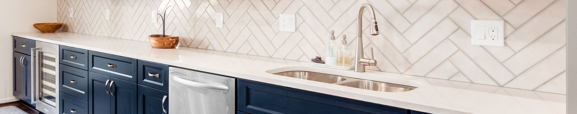
Midnight Blue: A refined alternative to black, midnight blue delivers drama without harshness. It works beautifully on lower cabinets or a statement island, especially when paired with marble or quartz countertops.
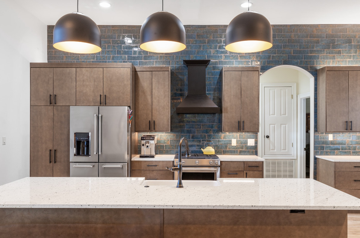
Forest & Pine Green: Deep greens feel luxurious yet connected to nature. They shine in both modern kitchens and updated traditional spaces, particularly when complemented by warm metallic finishes.
Aubergine & Plum: Unexpected but striking, these rich purple-based tones are emerging in custom cabinetry and secondary spaces like butler’s pantries. Used thoughtfully, they create depth and high-end appeal.
The key to pulling off darker shades is balance: layered lighting, warm wood accents, and textured surfaces prevent the space from feeling heavy.
4. Sun-Washed & Optimistic Hues
While some homeowners are going dark, others are leaning into soft, uplifting colors that radiate warmth and optimism.
Butter Yellow: This gentle, creamy yellow offers brightness without feeling loud. It works especially well in smaller kitchens that need light and cheer.
Coral & Muted Peach: Warm and welcoming, these shades add subtle personality. They’re ideal for backsplashes, accent walls, or painted pantry doors.
Sky Blue: Airy and serene, sky blue feels fresh in open-concept homes. It pairs effortlessly with white oak floors and crisp white countertops for a coastal-inspired look.
These tones are perfect for homeowners who want color that feels joyful but still livable.
5. Two-Tone & Finish Trends Elevating Color
In 2026, it’s not just about which color you choose- it’s how you use it.
Two-tone cabinetry remains strong, with darker lower cabinets grounding the space and lighter uppers keeping things open. Statement kitchen islands in contrasting hues are becoming focal points.
Beyond color placement, finishes are adding dimension:
- Matte finishes create softness and modern appeal.
- Plaster and limewash effects introduce texture.
- Natural wood grains balance bold paint choices.
- Painted range hoods act as sculptural centerpieces.
This layered approach makes even simple palettes feel intentional and designer-driven.
6. Choosing the Right Trending Shade for Your Space
Before committing to a trending color, consider these essentials:
Evaluate Lighting: Natural and artificial lighting dramatically impact how a color appears. Always test large samples on multiple walls.
Coordinate Undertones: Make sure cabinetry complements countertops, backsplash materials, and flooring. Warm tones clash easily with cool surfaces.
Think Long-Term: While bold shades are exciting, consider how they’ll feel in five to ten years. If resale is a concern, opt for trend-forward colors on islands or accents rather than full cabinetry.
Sample Generously: Paint large swatches or order sample doors. What looks perfect online can shift dramatically in your home’s lighting.
–
The 2026 kitchen is warm, expressive, and deeply personal. It reflects how we want to live, comfortably, confidently, and surrounded by tones that feel authentic to us. Whether you’re drawn to grounded earth tones, dramatic jewel shades, or soft sun-washed hues, this year’s trends prove that color isn’t a passing phase, it’s a design evolution.
Ready to explore the perfect palette for your space? Schedule your free consultation today and let’s bring your vision to life.
And if you’re still narrowing down your options, continue reading with our guide, “Color Psychology in Kitchen Design: Choosing the Perfect Palette,” to discover how different hues influence mood, energy, and everyday living.
Back